

A website for a Jeddah creative agency that shows the work itself, not links to it.
Overview.
Hotels, restaurants and brands in Saudi Arabia
Marketing managers at hotels, resorts, restaurants and luxury brands who want to see what the agency has done for businesses like theirs before they get in touch.
The work was one click away, on other sites
Projects pointed to Instagram, TikTok and Google Drive. Visitors left the site to see the work, Drive videos often didn't play, and the design mixed many fonts and colours.
A portfolio that plays on the page
Client circles open a project window with the scope and the reels in phone frames, services link to their work, and the whole site follows one theme, with English and Arabic side by side.
Walkthrough.
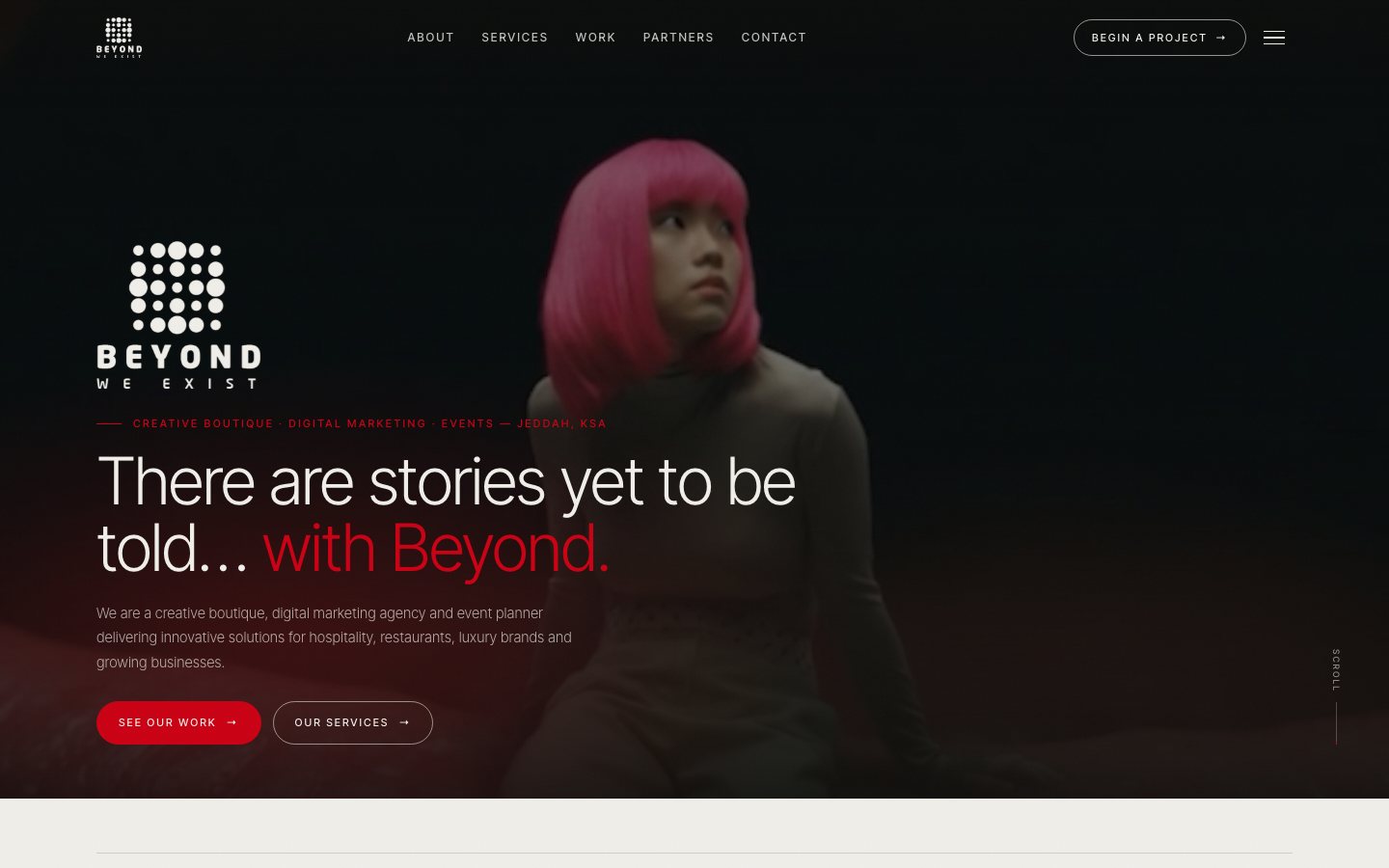
An agency site that opens like a reel
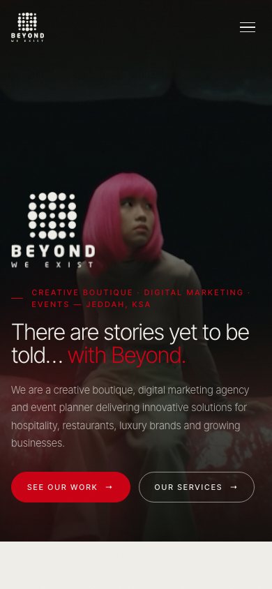
The home page starts on a full-screen video with the agency's dot-grid logo, then moves through the brand story, the four sectors it serves, its numbers and its clients. The client asked for a home page that reaches Contact in no more than four scrolls.
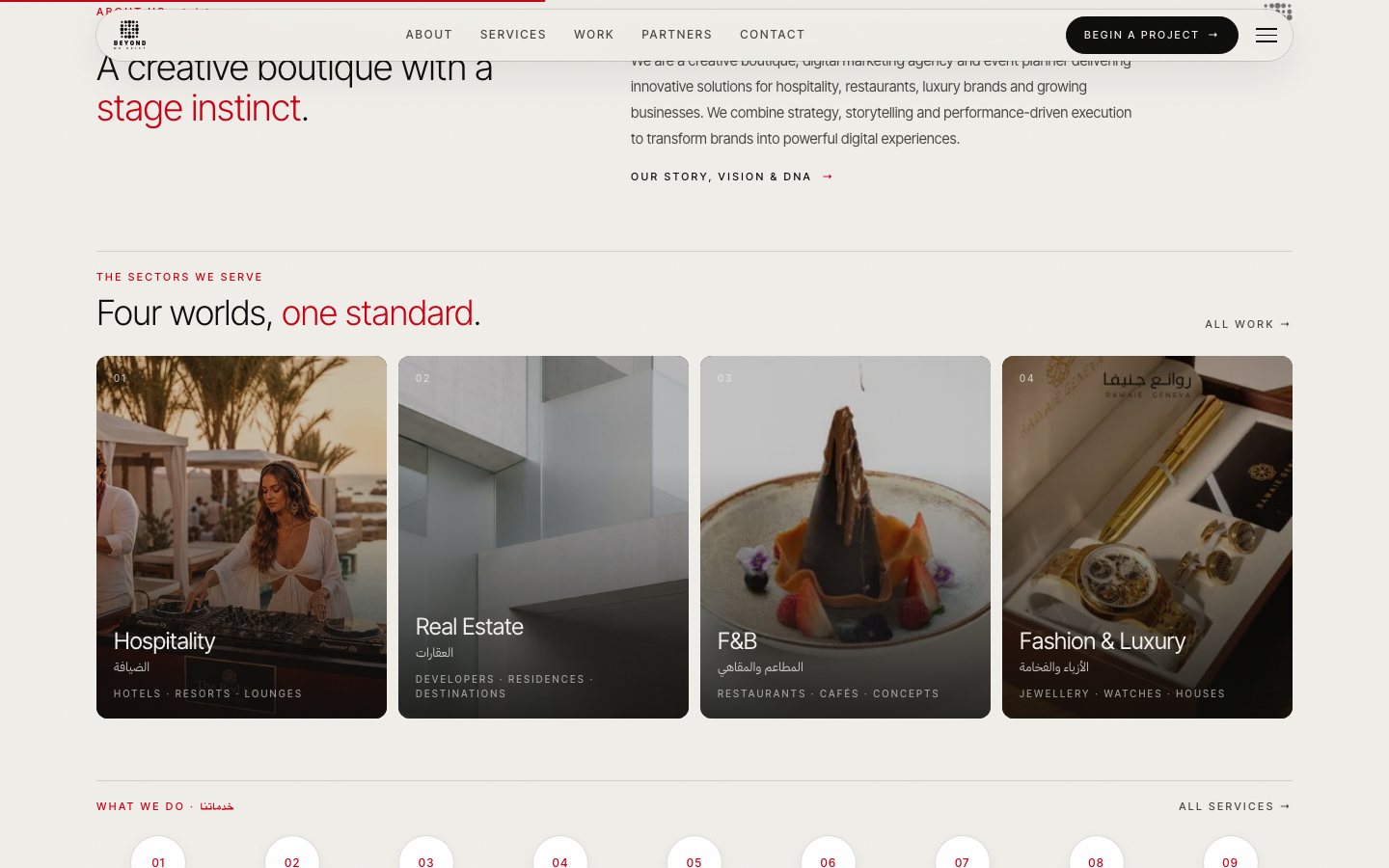
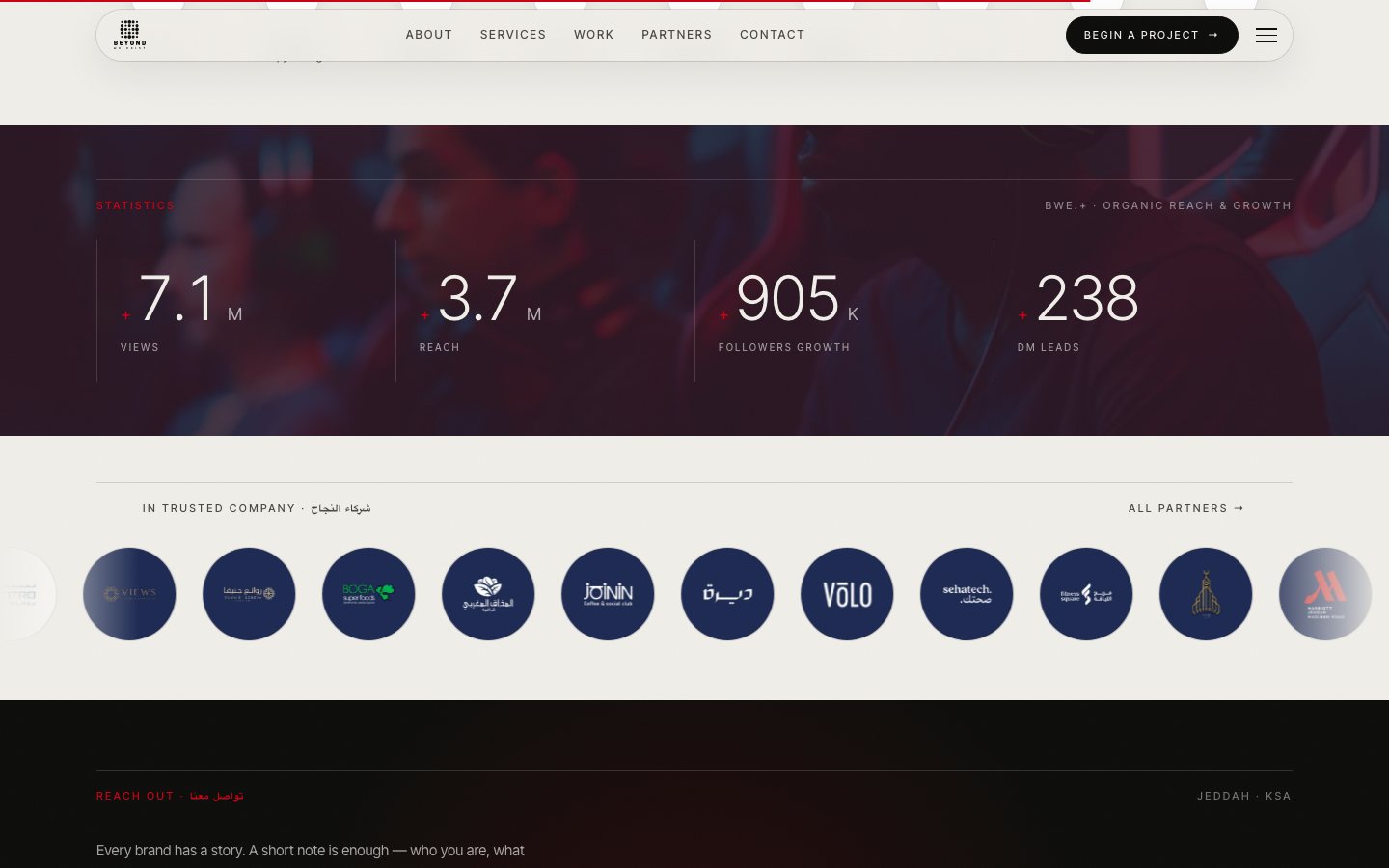
- 1Shorter on purposeOne section was removed and the rest tightened, so Contact starts at about 2.8 screen heights on a laptop.
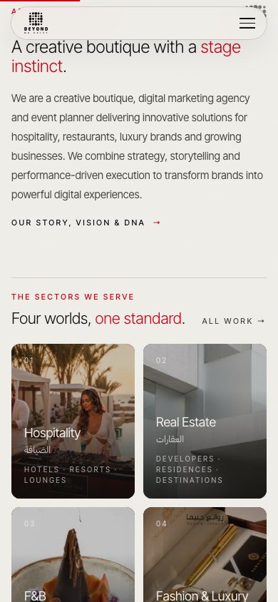
- 2Sectors as a gridHospitality, Real Estate, F&B and Fashion & Luxury are image tiles that open the Work page already filtered.
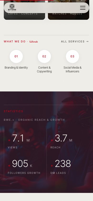
- 3Numbers that count upStatistics animate when they scroll into view, with the + and the M or K kept small beside the number.
The work opens on the same page, reels included
The agency's portfolio used to be a PDF of Instagram, TikTok and Google Drive links. Now each client is a circle on the Work page, and a click opens a window on the same page with what BWE did, the scope and the reels playing inside phone frames.
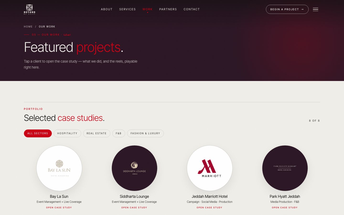
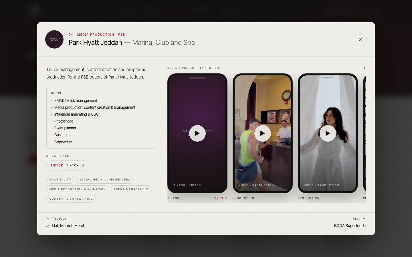
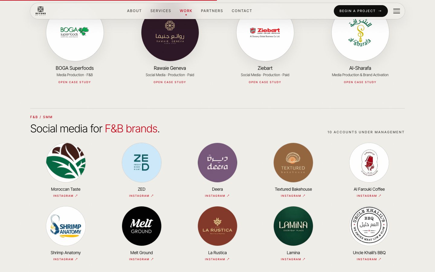
- 1A window, not a new pageThe case study opens at /work?p=slug over the Work page. Esc, the close button or the backdrop close it, and the arrow keys move between projects.
- 2Old links still workEarlier /work/slug addresses redirect into the window, so links already shared keep working.
- 3No Google DriveDrive videos were downloaded, converted to 720p and served from the site, so a visitor can always press play.
Nine disciplines on one page
The services page shows the nine disciplines as compact cards: a numbered circle, the title in English and Arabic, details and tags. Each card leads to the work done for that service.
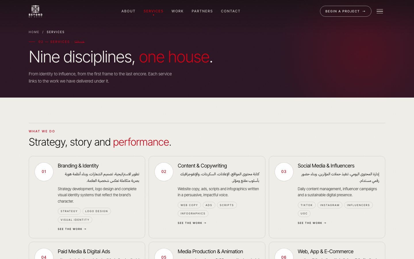
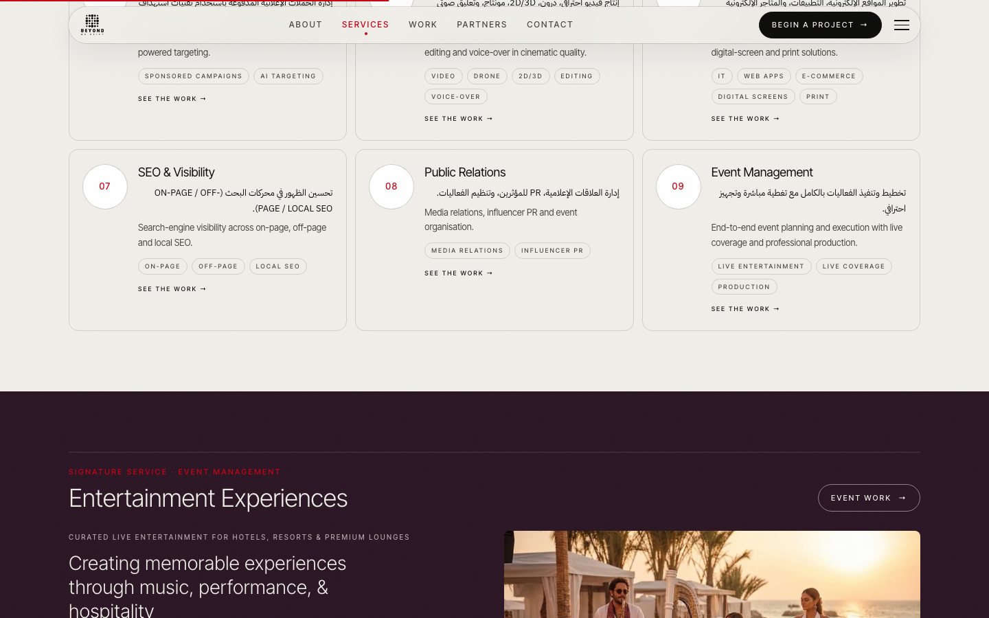
- 1Click through to proofEach service opens the Work page filtered to the projects that used it.
- 2Two languages side by sideTitles and labels pair English with Arabic, set in one Latin and one Arabic typeface.
- 3Three backgrounds onlyAs the client asked: a light background, the brand plum and a deep ink, with red as the only accent.
Clients as circles, the story behind them
The partners page lists the brands BWE works with as circular logos, the agency's identity everywhere on the site. The about page tells the brand story, vision, mission and values.
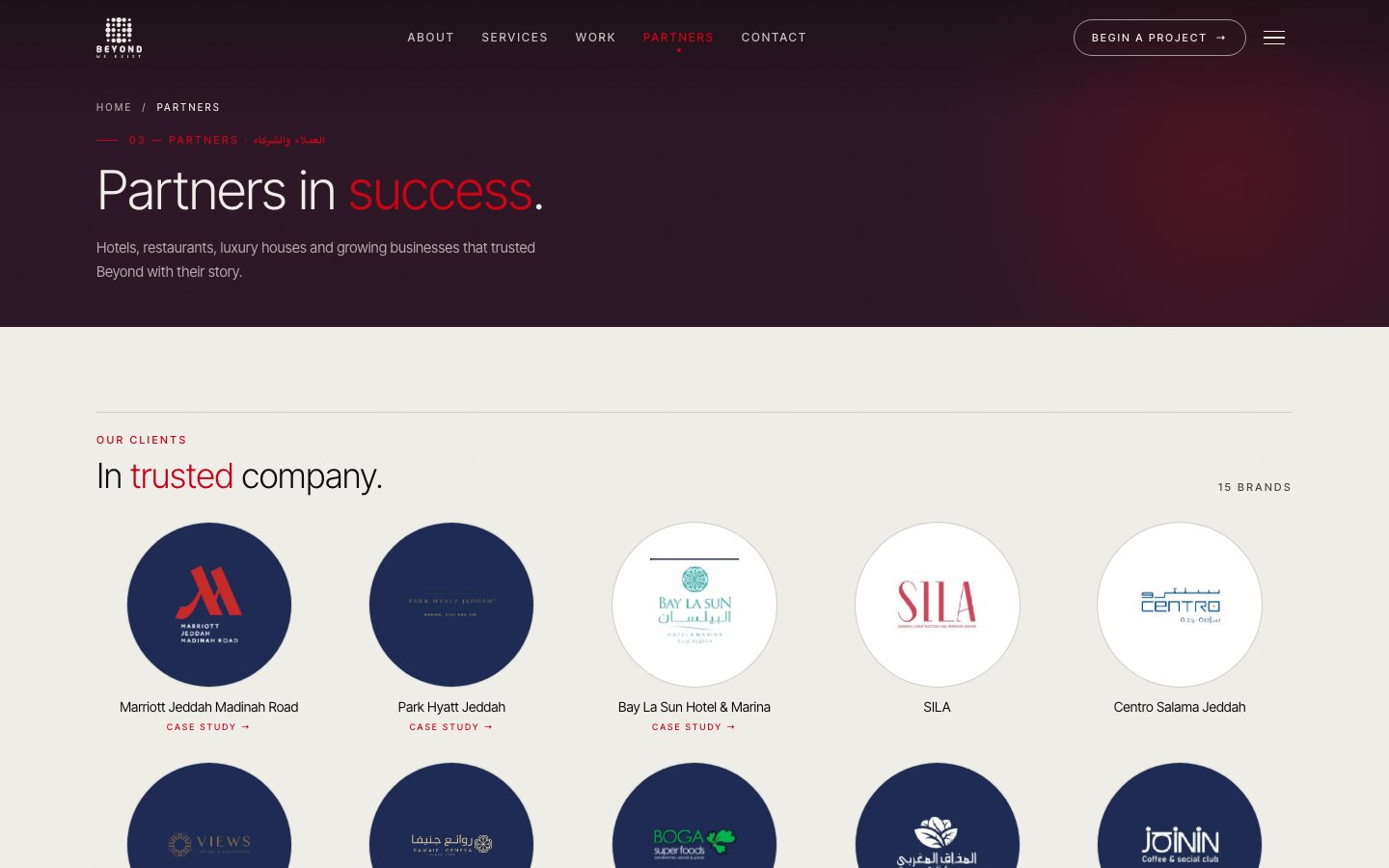
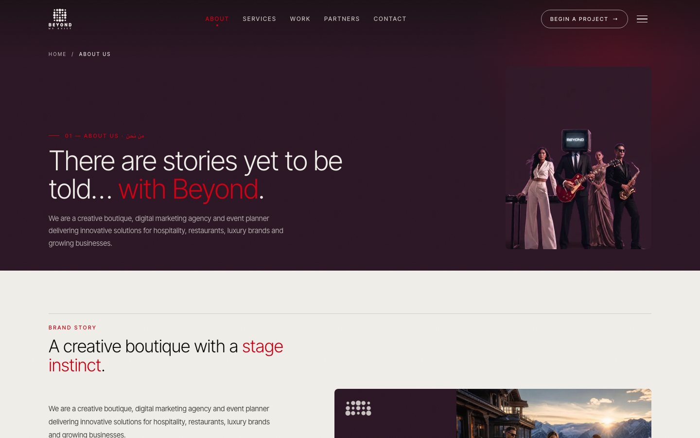
- 1Circles everywhereClient, partner and service markers are all circles, matching the BWE identity.
- 2Real logo, real contactsThe dot-grid logo from the brand deck in the nav, hero, footer and about page, with the agency's email, phone and WhatsApp.
- 3Content from the deckEvery text, client and project comes from the agency's content handoff, kept in one typed data file.
Client feedback.
Mobile.
Engineering deep dives.
1. Client feedback in voice notes, turned into a checklist
- Problem
- The client sent seven WhatsApp voice notes in Arabic over two weeks, each mixing new requests with earlier ones.
- Approach
- I transcribed and merged them into one table of fourteen requests, each mapped to what was built and where. Questions I couldn't settle in code went into a separate list to confirm with the client.
- Trade-off
- Writing everything down took time up front, but it ended the back-and-forth about what had or hadn't been done.
2. Videos the visitor can always play
- Problem
- The work lived on Instagram, TikTok and Google Drive. Drive videos don't play inside another site, and a broken player on a portfolio is worse than none.
- Approach
- Drive videos were downloaded, transcoded to 720p and served from the site; Drive photos were converted to WebP. TikTok embeds and hosted videos play in place, and every frame keeps an Open link to the original post.
- Trade-off
- About 60 MB of video ships with the site. If the host limits uploads, the files move to the Supabase storage bucket already used for the hero videos.
3. A case study that is a URL, not a route
- Problem
- The client wanted projects to open in a window on the same page, but a window still needs a link that can be shared.
- Approach
- The open project is a query parameter, /work?p=slug, so the window can be shared as a link and survives a refresh. Old /work/slug links redirect into it. Focus moves to the close button, and Esc and the arrow keys work.
- Trade-off
- Search engines see one Work page rather than eight project pages.
4. One theme file, one data file
- Problem
- Feedback kept coming back to consistency: too many fonts, too many background colours, details that differed between pages.
- Approach
- All colours, fonts and spacing live in one theme file, and all content (clients, projects, services, sectors, contacts) in one typed data file. Pages only read from them, so a change is made once.
- Trade-off
- Inline styles that read from the theme are less familiar to some front-end developers than utility classes.